So You Want To Be A Pixel Artist?
My name is Tsugumo, and this is what I know.
Chapter 11: Animating a Basic Attack
There are a LOT of animated GIFs on this page...The more there are, the slower they all run, so they may move a bit sluggish. You should be able to right-click them and choose View Image (in Netscape, I don't know what the equivalent is in Internet Explorer or Opera or whatever other browser you may be using) so that you just see the image by itself, and the speed will be a lot better.
Well, now we've covered the basics of creating and animating a sprite...but the cut and paste method of animating can only go so far. When you have a character spin around, you need to actually draw out the new poses. As always, we'll look at some example sprites from Street Fighter Alpha 3 first:


If the sprites are running kind of slow, then that might even help you out...Look at each of the animations and try to count how many frames they consist of. Also note the amount of motion in each of them...Guile's kick has his spinning around a full 360 degrees with around 9 frames. His weak punch is a simple little 5 frame jab. For the jab, it's likely that only 2 of the frames were drawn...The standing frame and the frame with the arm out. The in-betweens can be done in the pixel stage quite easily because they're just pixels being shifted around, the way we made a breathing frame earlier. I threw in Karin's frames in the middle row because they just plain look cool, heh...The motion in them is excellent. The straight kicks have a tight snap to them, and the spinning kick flows nicely. Sagat's kick is only a few frames, because when he finishes the kicking motion, he just cycles backwards through the frames he just used...This can be a good way of cutting down the amount of frames you need, but ONLY if it looks good. Sagat's kick works fine, whereas Guile's fierce punch (top right) wouldn't look right since when he puts his arm out it travels directly horizontal and doesn't go down like it finishes...so if Guile's frames were cycled backwards after his fist is extended, he would pull his arm way back as if he was elbowing something behind him. You have to decide what looks right for the attack...if you have a video camera or something, you could even tape yourself doing the move and see what limbs go where to get the motion going naturally.
Zangief's spazzing sprite is there to show the variety of movements...Often someone will show me their sprite doing an attack and the attack will simply be the arm moving or the leg lifting. It looks horribly unrealistic and unenthused...You want your character to look like they're really into what they're doing. It's like acting...exaggerating the character's movements will dramatically improve the feeling of their attack. Zangief looks like he's completely spazzing because his body moves so much, whereas Guile's jab is just a tiny little arm movement...but notice that even in Guile's toned down jab, his body still shifts slightly. When we were looking at doing a breathing animation, I explained how just shifting a few pixels can create enough movement to keep the character from looking like a cardboard cut-out. Guile's legs even move, and he's just punching with his fist. It takes a little while to add these extra details, but they can turn a static, boring animation into a much more lively one.
The general process of all this is going to be basically drawing out each frame and retracing them. Because this tutorial is based around personally doing sprites, I stress making things easy on yourself by only drawing out what you need to...Yes, you CAN draw out all the facial features in each frame, but you know in your head "the face is going to stay the same through the animation" so there's no reason to do it really. It's the same with drawing frames...if you know "frame 5 is just going to be the hand moving slightly", there's no reason to waste time drawing frame 5 because you know what you're going to change in the pixel stage. If you have a big company with a bunch of artists and you have a set of people doing the hand-drawn frames and a separate set doing the retracing, you would WANT to draw all the detail of all the frames because the retracers can't see inside the artists heads and won't know what to fill in gaps with...Here are some hand-drawn frames of Capcom's, from "Three" (the third Street Fighter):


That's a lot of frames...The top one isn't too bad, but the bottom one has got a zillion frames for just the smallest movements. The last 3 frames are almost exactly the same and a lot of that could be done at the pixel stage...BUT, Capcom is a large company and like I just said, if you have different people working on the same thing, you have to be specific. If you've ever seen the animation in Three (I can't find any sprites around the net, so you'll have to go to an arcade or something to check it out, and go see Capcom VS SNK while you're there because it's amazing to see the animation in it), then you know why there are so many frames drawn out...it looks EXTREMELY smooth. For practicing and such, we could probably get away with using every second frame in the top row because it will animate nicely. Having extra frames will smooth it out, but they're not required because for the most part the viewer's brain will fill in the missing frames. That's why when you show someone punching, you don't have to show the fist moving one pixel at a time...you can take large leaps and the viewer's brain will go "okay, it went from there to there" and map it out in their head in that split second of seeing the frames. But if you don't have enough frames and have too great a distance between the positions of an object, it'll look HORRIBLE to the viewer.
You have to learn where that line is between having enough frames to make it look animated and having few enough frames that it won't take you a year to animate one sprite. This is, like drawing, not something there's a formula for. It's something you have to study and practice. Get a videotape of some cartoons and go through scenes frame by frame and see just how many frames are used. Anime is really nice for this because it tends to run at a low framerate and only the essential frames are drawn. Disney and their insane frame rates is much more difficult to learn from. If you watch a Bruce Lee or Jackie Chan flick frame by frame you'll see the punches really only take 2 or 3 frames. This is what anime tends to do...you get the more "realistic" snapping powerful feel to the movements. Disney looks nice and has beautiful smooth animation, but the fighting movements (I'm going by what I remember from Mulan here) tend to look slow and lack the impact that cutting out a few frames would have. For the Disney fans (and the people who think those of us that like anime are stuck up and arrogant about it), I'm not saying I don't like Disney or anything, they do great work...But we're talking about action and fighting, and anime generally has the snapping feel that Disney tends to lack, and that's what's important to us in studying sprite animation.
Too many frames can ruin the effect you want...this is why a lot of 3d animation tends to look horrible. There's too many frames and everything moves TOO smooth to fool you into thinking it's realistic. This is a big mistake that a lot of people starting out will make because when you're working in 3d the computer adds the frames in between everything and people become frame-crazy. Sometimes "less is more"...Like look at Karin's front kick up above in the animated GIFs. She has some serious snap going in the kick and it LOOKS powerful. But her leg goes from back, to knee up, to straight out in a mere 3 frames. Only show what's essential, because if you insert too many frames you can ruin it. Granted, "Three" and Capcom VS SNK have a zillion frames, but only in the slow parts. Like in the top sequence of hand-drawn Capcom frames, you can see the guy has quite a few frames for his wind-up...Unforunately the next frame at the end was cut off, but it's the character's torso fully rotated 180 degrees from the last frame you can see (the hand you can see is the character's left hand). The wind up has a nice smooth feel, but they know where to drop frames and that quick snap makes the animation feel nice and fast. Again, this is something you have to study to get the hang of. So go rent some anime flicks (try the Street Fighter flick, which should be available anywhere by now) and check out the action scenes frame by frame.
I've already covered drawing and retracing a frame, and all I'm going to be doing for this tutorial on animation is, well, that...so I'm not going to show every single step because I already have and you have, of COURSE, read the other parts of the tutorial, heh...Anyway, first off I decided I wanted to do some sort of kick because they require more movement than a punch, so it'd be good for demonstrating. I ended up choosing a simple roundhouse kick like Sagat's and I'm starting out by planning what I'm going to do:

For the character I'm going to use, I'm going with a girl with baggy pants...the baggy pants are important for a reason I'll explain in a bit. These are just a few stick-people type doodles I did in the corner of a page to figure out what I was going to need...I ended up with 7 frames here. But in the end I want to have 8. The frame where her leg is up doing the actual kick, her pant leg is hanging down (like when you move your leg quickly, the pant leg will press against it on the side you're moving). I want to have one more frame after that where her foot is in the exact same place, as is her body in general, but her pant leg continues to move (so the bottom of it is resting against the foot instead of the top) because, realistically, that's what would happen. There's no real reason for me to do this, but I haven't done it before so I figure this is a good time. As much as I ramble on about everything in this tutorial, I'm learning a lot as I go, so I benefit from doing this as well. Anyway, so I figured I'd try throwing in that extra snapping frame to see how the effect comes out. Also, note that I'm not going to DRAW that frame...I'm going to do that frame in the pixel stage because I know that it won't take much work to shift a few pixels around, and if I DID actually draw it out, I'd end up retracing most of it exactly how I traced it earlier, so why not just start out with the retraced frame? I might drop the last frame where she's just placing her leg back because I don't know if it'll be needed...Just the one frame of her leg bending down may be enough to make the viewer know that her leg is being placed back down behind her. The next step is to draw these out so they're usable:
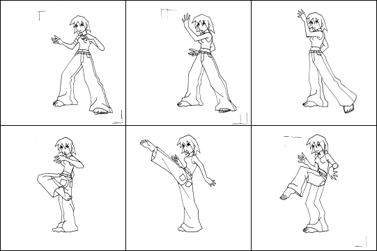
Each of these frames fits on about 1/4 of a normal sheet of 8x11.5" paper. They're scanned in the same way I explained in the first hand-drawn sprite chapter, so go check that if you want to know measurements and settings and such. The ideal way to work is to have a pad of paper and use that, because then you can use it like a flipbook to check how your animation will look, and the pages will always line up right. I didn't have a pad handy, and there was a stack of loose sheets nearby so I improvised by drawing little markers in the top left and bottom right of the sprite (those are those angled lines you see on some of the frames). When I put down a new sheet on top to make the next frame, I just traced where the markers were so that if I moved the papers I could line the markers up and know that the position of the sheets is right. If you're working with sprite size limits (like your sprites have to be under 64x64 pixels due to the way the game's engine is written), you might want to draw out boxes scaled up from the size you want...like make a square that represents the sprite size, so you can make sure you don't go out of the box. But thankfully sprite sizes are becoming less limited these days...In Marvel VS Capcom, Megaman is just a tiny little sprite, whereas Hulk is massive. BUT, it's good to work with restrictions because it gets you used to thinking things out.
Anyway, I decided to cut out the last frame like I figured I would, and I decided to draw in the face because it didn't take very long to throw in. For some reason I gave her toenails, which, as you can see in these shrunk down versions (shrunk down so this tutorial doesn't take a year to load...the original pics were bigger), just turns into big black blobs. The fingers do this in places as well, and I haven't even shrunk these frames down to the size I'm going to use. Oh, and I gave her a bandaged upper arm (her right arm) in the first frame but decided to drop that as well...just a random decision based on sprite flipping. Like in most games you don't want to draw frames for everyone facing both left AND right, so usually you'll just draw them facing one direction and have the game engine flip the sprite for facing the other direction. A TON of older games (SNES/Genesis days) use this because you had to get the most out of your sprites and instead of wasting double the frames to show someone facing the other way, you could fit in another character and just have them both be flipped. This is especially used in fighting games where there are so MANY frames...Having to do both directions for each character would take FOREVER. A little trivia thing I read somewhere: Deejay's pants (Street Fighter) say MAXIMUM down the side of them because it's a word that looks the same flipped left and right when it's written vertically. If it had said FIGHTING or something, some of the letters would be backwards when the sprite was flipped, or they'd have to draw up a second set of frames with just the letters changed around and waste a bunch of frames that could be used to add more attacks and such.
And you would think, "Well that's just in old games...what about NOW when there aren't really any limit to the number of sprites you can have in a game?" Well, believe it or not it's still done like this...I was wondering about it and hunted out some screenshots from Guilty Gear X (one of the newest and most incredible looking fighting games ever...easily tying, if not TOPPING the newest Capcom fighters in graphical quality) and found a character with a sword on their left hip, who draws it out with their right hand...But when they're facing the other way? The sword has switched hips and they draw it out with their left hand! Generally people won't notice this because the action is so fast and all they care about is "this button attacks with the sword".
I believe the main reason games still use flipped sprites is because while we can have practically unlimited amounts of sprites now, we also have MANY more sprites than older games...So where an attack animation would be 3 frames in older games, it's like 8 frames now. If you wanted to draw each character properly facing left and right, you'd have to draw 8 more frames and not only draw them, but totally change the positioning of things...Where a sword would slash from away from the screen to towards the screen (which would go from away to towards when the sprite is flipped as well), you'd have to draw the sword slashing from towards the screen to away for the other side, which requires a lot of work for something that most people won't notice or care about anyway. Another thing is that the player might NOT like it...If I do an attack facing one way and it looks a certain way, but I press the same button while facing the other direction and it looks different, it could throw me off and I'll be wondering "well does it do more damage when I'm facing the right? Is it faster when I'm facing the left?" Anyway, the point is that sprite flipping is okay...Everyone does it. This is also why most characters are designed completely symmetrical. If both the left and right sides of them look exactly the same, then the sprite flipping is much less noticable. If you had a huge metal cyborg arm type deal going on just one arm, when the sprite was flipped it would look like the arm switched sides (like the sword attatched to the hip). So most characters are completely symmetrical.
This is why I decided not to give my character a bandage on her one arm. It won't matter because I don't intend to use this sprite for anything but this tutorial, but you know...it's good to keep these types of things in mind when you're designing a character. Anyway, back to working on the sprite...Next I'll take the frames and make them into an animated GIF (there are lots of programs on the net, and most are probably better than the crummy little shareware one I use, but it does the job for me so I like it) so I can get a general idea of how the animation will look when I finish the retracing and put it all together:

It doesn't look too bad. There are a few things I'll have to fix though...One is that I don't have that pant leg snapping frame in yet, so I don't know how that will turn out at this point. The main problem is her size...In the last frame of her kick where she has her leg beginning to return to it's original position, and the first frame of her fighting stance, there's a slight size difference in her body. In the last frame of the kick even though her leg is bent, she's still up quite high (in fact she RAISES a little bit from the frame before it), which doesn't look right. So I'll have to adjust that when I retrace her. A quick way to do is is to trace her how she is, and then just shift down her upper body a pixel or two in her belly (because that's the part that I think is stretched too far).
You might also be looking at that and going, "Well why don't use just use those frames? Why are you wasting so much time retracing everything when the lines on the drawings are so thin and neat already?" They're the wrong size, for starters...but I can just shrink them down so that's not the main reason. The main reason is anti-aliasing...This is where anti-aliasing becomes the enemy...Here's an example of why it's a sprite artist's arch-nemesis:

Anti-aliasing is a way of smoothing out graphics...If you have a black line on a white background, it will insert shades of grey pixels inside the black line and around it so that when you're looking at it from a little distance away, it looks nice and smooth (especially for curves). This is great if you're doing general art, like a poster or something...but for sprites, it's evil. Because the pixels are blended together, you get shades of light grey (not quite white) pixels around the outside edges of the sprite like you see above. Videogames don't use anti-aliasing in-game (except for the newer 3d games, and not many of them use it yet) because it's slow to calculate what shades to use for everything. If the sprite is running across a rainbow in the background, it's got to calculate all the sprites on the outside for each shade of color in the background...it's just not feasable to do right now. The reason things look anti-aliased when you're playing console and arcade games, and you generally can't see the pixels, is because TV screens blur things slightly automatically...just because of the way they're built. When you play the game on a computer (like with an emulator), you can see all of the pixels because a computer screen is more precise. Anyway, the whole thing I'm getting at is that anti-aliasing can ruin your sprite. You CAN just shrink the sprite down and go through erasing all those white pixels around the outside, but I find that it takes just as long as retracing the sprite would anyway, so I like to retrace the sprites.
Another thing is that if you look at her fingers and toes you can hardly tell what's going on because the pixels have been blurred together from the anti-aliasing. By retracing using pixels, I can define where the fingers and toes go and make them look better. The last and final reason is that this anti-aliased sprite is like 37 colors. If you're working with a palette that only allows you 256 colors on-screen at once (standard VGA palettes...the SNES and Genesis used this as well), you've just wasted 37 colors on what's essentially "black and white". Now imagine if you had different colors for the shirt, pants, skin, etc. Each of those would have to be blended with the black outlines instead of just white being blended, and you could end up with a sprite that takes like 120 colors. That's almost half the palette...if you want 3 different enemies and a background as well, you're in trouble. By retracing, you can control how many colors you're using. Even Capcom VS SNK, one of the newest and greatest looking fighters around, uses only 16 colors max for each sprite.
Moving on, I'll retrace all the frames using pixels and color them in the same way I did for the previous animation chapters in this tutorial:
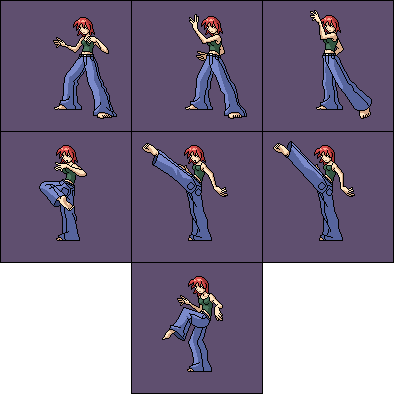
I was actually planning to do a lot of cutting and pasting with the hands and just rotate them around to get the general look of them moving...but the drawings came out clearer than I expected when shrunk down and I ended up basically redrawing the hands each time because it didn't require much effort, and as a result the hands look a lot more natural because they change through the motion. I just cut and pasted her head onto each of the bodies as I drew them because I didn't need the head to rotate or change for this animation. The bodies were all redrawn completely for each frame, and to get the placement of the foot (her right foot) lined up properly, I simply turned down the opacity on the layer so I could see how the foot was drawn in the frame before and made sure it stayed in the same general area. In the hand-drawn frames, the foot sinks down slightly and such because it's not pixel perfect...easily fixable in the pixel stage.
I also extended her leg when she kicks because I wanted the kick to cover a longer range. This is another mistake a lot of people make in the beginning...usually when they're doing attacks where the character just lifts their arm or leg boringly. The attacks don't really GO anywhere...they just attack right in front of the character. A game plays more strategic if the attacks take up different ranges, so you want to make sure that there's some reason for doing the attack...if the enemy has to be right BESIDE you for the attack to hit, you might as well throw them instead. If you're working with limited sprite sizes (like 64x64 sprites), you can either make sure that when the character attacks they only extend forwards (like so instead of her arm going back when her leg is extended like I have, the arm would be in close so the furthest point behind her would be her back and hair), so that you can draw the long range attack in the entire sprite box and have the game engine offset it to line things up right. Imagine being trapped in an invisible cube (like a mime, heh)...you might stand in the middle for your fighting stance, but when you kick you'll hit the wall. So when you get to where your leg is supposed to be extended, you step back so your back is against the opposite wall and then you can stretch your leg. Another method (which you can use for REALLY long range attacks as well...like how Dhalsim's arms stretch in Street Fighter) is to just have the extension of the attack go into another sprite box which the game's engine places beside the characters normal box. The easiest method, of course, is to simply beg your programmer to make the engine support sprites of any size, heh...
Note that the extra frame has been inserted now so there are 7 frames instead of 6. The 5th and 6th frames are the ones where her leg is extended and I did the pant leg flapping thing, as well as SLIGHTLY shifting the arms and making the hair go forwards slightly (like she was going forwards so the hair was behind her, and then when she stops suddenly, the hair keeps going for a second). I added small details like the hands and hair (her mouth closes as well) because like I said earlier, just that small pixel movement will help make things look a little more lively. If just the pant leg moved it would make the rest of her look frozen in stone and seem visually odd.
ANOTHER thing to note is the shading...The shading is based off a light being in front of her. "But when the sprite is flipped so she's facing the other way, the light source will move with her! And what if she's fighting against herself...it'll look like the light source is between the two characters! Won't that be weird?" In theory, yes...but like the reversal of weapons and one-sided gear, you have to make some sacrifices like that. You could duplicate all the frames and change the lighting on them so it always makes sense, but that's a lot of time and frames wasted on an effect that not many people will notice. Like before, even the new fighting games and such do this and no one really minds. You could pretend the light source is between the sprite and the player and give everything shading around the outside, but it looks really odd and you can't use shading to show depth...Like you couldn't have the back leg be in shadow because the light source would be shining on whatever's facing the player and by having that back leg in shadow you can create a feeling of foreground/background that helps the player think of the characters as being 3d instead of flat cardboard cut-outs.
So now we string all these frames together into an animated GIF to see how the final version looks and we get something that looks like this:

It doesn't look too bad. The little things like the hair moving slightly help that "leg in the air" pause. Because I planned out the frames in advance, everything flows quite nicely. Her left arm moves in a nice motion (unlike the oddly rotating arms of the guy in the breathing animation section), and her leg travels right into the kick. The timing of the animation is important (if you're viewing the whole page and all the sprites are animating, or you have a bunch of other programs running as you view it, the animation might run a bit slow...see the warning at the top of the page for more info)...I have the first frame pause for a bit (so she doesn't keep looping super-fast), and the first two frames go at a relatively fast speed. Then the frame where her knee is up just before she kicks goes a little faster than any other frame so that the player only sees it for a small fraction of time...just enough to register in the viewer's head as the foot being there and travelling in a straight diagnol up to where the kick happens rather than, say, swinging in a half circle up to it. Then the kick hangs for a second to show the power of the attack (rather than just tapping and returning which would be something you'd see in a jab or poke), and returns to the normal fighting stance somewhat quickly the same way the knee was up before...just enough time to register in the viewer's head. Because I cut out that one extra frame at the end, I had to speed this last frame up. If I let it hang for a second (the amount of time it would take to show both of the last two frames instead of just the one), it would make the animation look choppy and strange. By increasing the speed, the viewer's brain fills in the missing frames and it looks better. This doesn't work all the time, however...but it's something to play with so you can keep from having to draw a dozen frames for one attack. As I've said a number of times now, never make things harder on yourself than they have to be. If you have a team of underling artists chained to computers at your command, then by all means go nuts and make them draw a zillion frames while you go out for lunch, heh...But most of us don't have that, so just stick to keeping things simple.
Back to main...