So You Want To Be A Pixel Artist?
My name is Tsugumo, and this is what I know.
Chapter 5: De-Mystifying "The Greats"
If you're into RPGs, then you've probably played some of the greats. What I'm going to do in this chapter is take them apart piece by piece and we'll find out just WHY they're so great. Now let's talk Secret of Mana 3, which is quite possibly the most beautiful game I've ever seen:
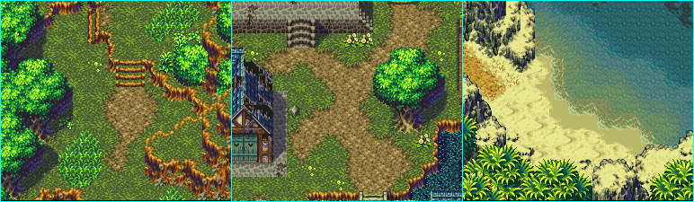
Impressive, isn't it, heh...But let's break it down and see just WHY it's so impressive. Take a look at the first screenshot. Ignore the trees and mounds of dirt and everything, and just focus on the ground. Now what makes that ground different from the ground in the examples I've done above (say the log house one in the gradient section)? The difference is interest. If you look at the ground closely, you'll notice they didn't just take a grass tile and throw it all over the ground, surround it in trees, and say "Okay, we're done. This is our forest." On that first pic there are maybe 4 different types of flowers, plus different "lengths" of grass, patches of dirt, and clumps of grass! Yes, it's all drawn exceptionally well of course, but it doesn't mean no one else can do it. Let's take a small chunk from that shot and blow it up. A side note for you...The thing I was talking about before, eliminating the grid. Well SoM3 has definately done that. I had to just grab a random box size because I have NO idea where one tile ends and another begins. That, my friends, is success:

Now just focus on the grass...Count the number of colors in the grass. 3. That's right, only 3 colors. Just like the grass we were making earlier in the tutorial. "But it doesn't LOOK like 3! When you look at it from afar, it looks like a ton of different shades!" That's right, but remember that it's only done with 3 shades. So HOW exactly did they do it? Take a look at a large clump of grass, with the long blades. You can see there are areas (the "surface" of the blades) are drawn using the lightest green. Lots of it. They've also used the middle shade of green to "outline" that light shade, but there isn't much of it. Now look at a "flat" looking area, maybe the part at the bottom, just right of the center. That looks flatter, but notice the colors...This time they've used only the dark shade and the middle shade. The light shade is simply dotted here and there to give the illusion of blades of grass poking up, catching the light. But really, the rest is just scattered pixels. Half of them aren't even shaped like blades of grass! You can see clumps of the middle shade that are shaped as squares, squiggly lines, Tetris blocks...But when you look at it when you're playing, it looks like grass. So basically what we've learned from this, is to have something appear brighter, you don't need another shade of the color, you simply have to decide how much of a color to use. A quick note: If it looks like there's another shade of green, like a lighter one in the bottom right of the grassy area, there isn't...It's the light green of the tree making it SEEM lighter. We'll talk about this stuff later in the tutorial. Just go with me on the 3 shades of green grass for now. Let's take another area, from the second shot this time:

So let's look at the dirt this time. 4 shades. The 4th (darkest) shade is used only rarely, too. Just sprinkled pixels here and there to give it some more depth (like uneven land, dirt mounds and such), as well as outlining the grass (which would, in theory, be casting a shadow anyway). Now it's just placed here and there and surrounding...but it does more than you might think. To show you a drastic example of just how much that shade DOES for the picture, I've gone and changed all the darkest shade to one shade lighter:

"What happened?! It's all flat looking now!" That's right. Not only that, but if you squint your eyes a bit so the colors get a bit blurry, and look at the two pics, you'll notice that while you can still tell where the dirt and grass sections are in the original shot, the grass and dirt begin to blend together too much in the edited version. As well, if you look at the middle of the dirt, it feels more flat, less rocky, than before. It's that one darkest shade. Now look at the original shot again and look WHERE the dark shade is placed exactly. It's never just out in the open, surrounded by bright shades. It's always placed where there are dark shades. Like if you were to take the edited pic where I've taken out the darkest shades, and place darkest ones only where there's dark brown. It's like if you had different depths of holes in the dirt...A few of them might be deeper than the others, and those would have the darkest pixels placed in them to show that. It makes the terrain feel rocky and gives it more depth variation than the grass, because the grass uses 3 shades and hasn't got a 4th, darkest, shade. So what would it look like if the grass DID have a 4th shade? Well here I've added one:

Now if you compare the grass in both variations, you can see the one with the 4th shade looks like it's got more "thickness" to it...Like there are more blades of grass underneath, having shadow cast on them. And this can be nice...But now look at the two pics and squint your eyes again. Which grass looks like it's "bulging" more? Like as if it were planted on a high mound of dirt? The left one. But why? It's that 4th shade. What happens is that with the 3 shades, the grass has a lot of "pretty dark" green, which gives it a flat "plane" of it's own to rest on...On that, the lighter shades of grass are placed and look like they come up from that. Mentally, we decide that this grass must be higher than the dirt, since it doesn't have the dark shade which says "This texture sinks into the ground." In the grass with the 4th shade, it becomes harder to distinguish from the 4 shades of brown, because now that the grass HAS that darkest shade, it feels more like green dirt. As well, you may also notice that I've used a lot more dark green in the grass than there is in the dirt...What this also does is make the grass seem even LOWER than the dirt. It's hard to tell but if you relax your eyes and look at it a bit, the dirt path seems to be above the grass. It's a natural mental calculation: If it's lighter, it's closer. So the dirt that has less of the darkest shade, seems lighter, and feels closer to the "camera". The grass, now a mound of dark and light pixels feels pushed back. And it's all because of that one little shade.
Let's look at the almighty tree from the second shot now:
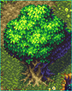
Quite the tree, isn't it? But look at it closely, the big green area first. Excluding the darkest (practically black) pixels thrown in here and there, the green shades consist of 5 different ones. Only 5. "But it looks so...tree-like...and...poofy...How?!" If you stand back a bit, it looks like there are a few big "chunks" of leaves, and yet, they're not divided using a black out line or anything...They just FEEL there. Well it works on the same principle as the almighty sphere with a light on it. You've probably seen this all over the place if you've looked at ALL into shading concepts, but I will quickly re-create it for this example:

Now here's a sphere with a light shining on it. You can instantly tell there's light shining on the top right of it because that side is lighter, and the other side is of course, darker. It FEELS 3d, even though it's still just pixels like anything else we've been looking at. Now let's re-create part of the tree with this sphere:

Now this LOOKS 3d...But remember, it's still just a bunch of pixels on the screen, just like this text. But looking at it, the spheres look like they're in front or behind eachother...They have "separations". They're all stuck together, but it feels like there are different sections to it. This isn't done by drawing a black line, it's just done by shading...Look at the middle of a sphere...The pixels are all pretty much the same shade, so it feels like one object. But then look at where two spheres overlap eachother. The change in shade in the pixels is MUCH more dramatic. The three going from top left to bottom right are especially good examples of this...From nearly black to instantly nearly white. That's why they look like they're two separate areas. So let's look at the tree again:
Now maybe when you look at it, you can see how it relates. Where the lightest shades on the spheres were, the yellowy shade is used. As the shades get closer to where the "section" ends, they get darker, until the section ends and the next section of leaves begins, in which case it's suddenly out of the dark greens and back into the light yellow. So now glance at the bottom left of the tree leaves...there it looks REALLY dark, doesn't it? But look at it closely (ignoring the dark purple/blue shades, I'll explain those in a moment)...It's not darker, it's just that it doesn't use any yellows. It's just like how the grass was made! It's just using dark shades, which when side by side to the light shades, FEELS like it's further back, shaded. Now on a side note, the tree trunk looks lighter than the dirt...But it's not. It uses the SAME shades as the dirt...Only it uses a large area of the lightest shade, which makes it FEEL brighter than the dirt. It's all strategic pixel placement.
Now I'll explain the weird blues and purples...This goes into color theory, which says that shadows are NEVER black. They always have some blue in them...always. When you use black, it makes things look "flat" and uninteresting...When you use a black that has a bit of color in it, you bring it forward, make it feel closer to the "camera". This is why if you look at the darkest parts of the tree, you can see they're not black...They're just very dark shades of green. And going with the blue shadow rule, this is why half the tree is shaded in blues and purples. It's the shaded area. Now you don't actually have to use blue in all your shadows, but you should keep that in mind...Don't use thick black shadows (unless of course it happens to look really good, like for a night scene of some sort, heh). Now let's move to the third shot, the sandy beach:

I'll take a moment first to mention that this is a great example of eliminating the grid. It's nearly impossible to figure out where each tile is on this map. It's also interesting. How many times have you seen people making their own RPG and they'll take a "sand tile" and use it just like they use the grass tile, throw it all over the screen, and call it a beach. Now look at this one...Not only are there different "types" of sand (from the middle sandy dune type stuff to the watered down darker outlining areas), but there are orange rocks and dead grass blades sticking up. THIS is interesting to look at.
"Astounding! There must be a ton of shades in that sand!" Well, count them. In the yellowish sand, the main stuff, there are a mere *4* shades. And yet, there seem to be distinct areas of sand...the main area, the shadows of the dunes, the light shade just before the dark watered down sand, and finally the watered down dark sand. And yet, it's all done with the same 4 shades. The watered down area is simply the second darkest shade used with no other shades...To give it a flat, smoothed over feeling (if you've ever been to a beach, you know that IS what sand looks like when it's been splashed by the waves). The area dividing the bright sand and that watered area is just a long line of pixels of the middle shade. The light sand is just the lightest shade. To get the grooves and curves of the sand and it's dunes, the second lightest shade is used for the smaller areas...For the large shadows, it's just light to dark shades, the darkest being where the dune would be the highest, and casting the most shadow. It's hard to notice at first, but the darkest shade is not just a dark shade of the yellow, but it's got a slight blue cast to it...Just thought I'd point that out, heh.
Next up is the amazing and almighty Final Fantasy 3. Hailed as the best looking of the original FFs, and with good reason, as you can see:


FF3 is less extravagant than Secret of Mana 3, but SoM3 was made later so that's to be expected. Anyway, FF3 isn't QUITE as impressive but nonetheless if you can do graphics like this, then you should be writing this tutorial, heh. Anyway, we're here to learn from these screenshots, not oogle them, so let's begin with the top left one:
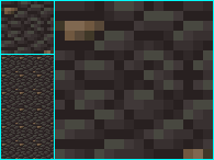
This is a floor tile from the main sections of town. I've got a tiled version, a slightly blown up version, and a 900% version, heh...Ignoring the brown rocks for a moment, the grey rocks consist of...guess how many shades...4. Surprise, surprise. There's not a whole lot to say about this tile, but notice how the darkest shade is used to shade each rock...just a one pixel thin line here and there. Each rock is then made up of the other shades. Study this for yourself, heh. But take note of the tiled version...Can you tell it's tiled? Yeah, you can. BAD Squaresoft! BAAAAAD!! But, because the rest of the game looks just so good, we'll let it slide this time, heh...But as you can see, using the rock in the tile makes the grid once more appear. To counter this, they should have had a tile with no brown rocks, this one with both brown rocks, and one with just one brown rock, maybe in the bottom left or something, somewhere slightly different. Listen to me, I'm actually criticizing Squaresoft, heh...So moving on, let's talk "interesting" for a moment:


Take a look at the shot on the left. It's interesting...but why? Well, it's the attention to detail. Of the stuff I've seen, people who try to do a section of a city like this, leading into water will do something like what you see on the right. It does the same thing, it shows the city drops down into water...But it's so boring to look at compared to the other one. The other one has not only the blue tinged slated rock path, but the orange brick outline as well as the "lining" of bricks that completes the look of the bricks laying up onto the top. As well there are pipes thrown in here and there, for even more interest. Also notice the part that drops into the water. In the right shot it's just the same tile, then water. But in the left, the top set of side bricks is normal, the next row is a bit darker, and then the water overlaps the bricks, creating a sort of translucent effect, making the water seem more like water and not black oil or something. Just wanted to point this out for a second. So let's move on to the second shot:

The big question on everyone's mind is probably "How in the world did they do those ROCKS?!" I honestly have no real idea...I could probably go and divide up all the tiles and find out which ones they use where and just how many make it up, but I'll leave that as an excercise for you, heh...If I went and did things like that, I'd be writing this tutorial from my grave and still be nowhere near done, heheh. However, taking apart the colors, they're made up of about 7 in total...From the lightest purple to the darkest black. To get the flat look, so it's sort of like rectangles of rock jutting up, notice that they used the bright colors only on those flat areas. The flat colors then dramatically switch to darker ones and black is used for the shadow, while darkening lines drop down into the shadow to give it the 3d effect. Heh, that's all I'm going to say about these rocks...I wonder how long they had to lock the tile artists in the basement before they would actually try to tackle this set, heheh. The rest of this is pretty much made up the same way as the other parts...Around 4 colors per tile type. Take the image into a paint program and zoom in and do some analyzing. Now for the third shot:

In this one I also want to point out the attention to details and interest. Check out where the door area is. It's not just a solid wall with a door in it and then the upper floor. It's got the door, surrounded by large pipes, a fan above the door, steps leading up to the door, those...support...things (I don't even know what they are, but they look good, heh) above the pipes, then larger square bricks, and THEN the upper floor, which is also surrounded by a brick border. As well, on the left joining chunk, there are those triangle patterns on the side of the bricks, it's not just the same brick tile as everywhere else. Even more detail, on the columns beside the pipes, they're not just columns, but they have those bricks that stick out, the hinge things near the bottom, and then grates at the very bottom (again, I have no idea what they're for, but they make it more interesting to look at). Of course then they go and ruin things by using that desert tile over and over and over in the desert...Some rocks or dead trees or something would have been nice to break the areas up a bit. Here's a closeup of those columns:

These tiles use 9 colors, but they're all shades of grey and are used all over the place which makes them less of a waste (if you used 9 new shades for each tile, you'd soon run out on a 256 color palette). Notice the far left and far right sides...The bricks are made up of only 2 or 3 colors, and they're the darkest shades, whereas the middle bricks, the lightest, have the bright shine and use more shades. The less detail, the more it feels like it's in the background (remember the grass feeling more flat where it used only two colors earlier in the tutorial?). Now for the final shot:

Here's something I found amusing that I hadn't realized until I began actually LOOKING at the tiles...Notice any similarities between these two rooms? They're both from different towns, and they both have different "feelings" (the left feeling more cold and lonely, the right feeling warm and friendly). They use the exact same tiles, with different colors. And it works, because they're used in two totally different towns. By the time you get to the second town, the tiles in the first aren't fresh in your mind anymore, and often you won't realize they're using the same tiles. And this probably saved hours of tile drawing, heh...While they're the same underlying tile, you can tell one town's houses from another because of the palette swapping. Well then, let's take a section of the wall and look at it tile by tile:

Here's one of the columns...At first glance, it looks like a column is just a column of tiles going up...But it's actually made up of two tiles, which is actually more efficient. If it took 1 column of tiles for the middle flat bricks, then it would take a column on both sides for the diagnol sections. By using two columns, the diagnol sections are part of the middle column's tiles, meaning they can fit more onto one map because it takes 1 column less. The problem with this method though is that now the only way to have more than one diagnol column in a row (to make a section of the house that goes diagnol for more than just that small chunk), they'd have to make a special repeatable diagnol brick column and use that. However, none of the maps do that, they always have these sections that stick out only 1 more tile. If you look at the screenshot of the room above, you can see that to do a corner border (like the column that would go to the left of the section I divided up), they use only HALF of the column. So they have two halves again, and to do a large beam in the middle of a wall like right above the bed, they simply put these two beam halves together back to back to make it. It's all in the setup, people, heh. Anyway, I just wanted to point out the make-up involved in this section. If you do some color counting (you'll be doing this a lot if you're interested in becoming a better pixel artist), you'll notice, again, except for the few really black pixels, only a few shades are used.
An interesting feature of the inside maps is the upper layout...This is more evident in the shot on the right up above. Check out the corners...they have those double beams that cross the corners, and once in a while there's that beam that goes vertically above everything...As well the borders never go from just inside tiles to black tiles. There's a wood frame outline around the entire room. Again, it's attention to details like these that make things interesting. Also note the "upper" beams and such are done with dark shades of brown, not light ones. If they were done with light ones, they'd be too distracting and ruin the rest of the map. As well, if the lamps on the walls were underneath the beams like that, the tops of them wouldn't have light shining on them, so it's realistic as well. But mostly it keeps them from blending in too much with the rest of the background.
Okay, so enough with the analyzing. I could go on for hours picking apart games like Chrono Trigger, Zelda, Shining Force 2, Phantasy Star IV, and so on but it would take forever and I'd be doing all the work for you...From all this, you should have learned how to take apart a map and see just how it's made. Take note of the colors used, how the sections are divided up, and the different types of contrast and color selections chosen. In time this will become more natural and you'll be able to figure out how many shades or tiles are used from just glancing at the map for a few seconds. This skill is VERY important in advancing art-wise.
Back to main...