So You Want To Be A Pixel Artist?
My name is Tsugumo, and this is what I know.
Chapter 6: Secrets, Shortcuts, And Strategies
Oh my god! What's this?! It's...it's...Final Fantasy 1:

"This tutorial is about learning to make GOOD art...So why is a screenshot from a NES game here? They only use 16 colors, don't they?" That, my friend, is the whole point. See, back in the old days, they didn't have a huge 256 color palette to work with, couldn't do the "wonderful" gradient fills, couldn't have 30 different shades of a color...You had to make do with what you had and work with a tile until it looked right. Because of this, old games are useful for learning tricks from. So let's step into the good old days for a bit and look at this shot from Final Fantasy 1 closely:

Now the first one is the floor tile...Unfortunately, as you can see in the full screenshot, this one doesn't even come close to killing off the grid look, but we'll just say it's because it was one of the originals and perfecting the graphics wasn't exactly the highest priority back then. However, looking at it, you know it's a floor, and you know it's a rocky floor. Yet, the tile consists of only *2* colors. "But if you have one dark color and one light color, how do you make it look like there are more shades?" This is where we get into the wonderful of dithering. Dithering is when you mix patterns of pixels to achieve different shades...used mostly in the old days when palettes were more limited and you wanted smooth looking shading. I'll show you how exactly dithering works and how you can use it, in a moment...First I just want you to look at the rest of those tiles. The second one, the light bricks, have a third color...white. It's used as a highlight. In the next wall tile, the "inside" wall, you look at it and it seems darker than the other. It seems this way because it has more black at the bottom, a light grey instead of a white, and no real highlight on the bricks. It's not any darker a shade of grey, it's just got the pixels placed differently. Also note that these bricks do not look like the gradient bricks I made earlier in the tutorial...These are old, scratched and scraped bricks...And they give that feeling when you look at them. Even back then, Square knew what it was doing. Last up is the grass tile, which is just for amusement, heh...They're using the "few light green dots on a darker green background" effect. This is pretty much where it started from. Now let's look at our first tile drawing trick, dithering:

This is dithering at the simplest level. If you sit back and casually glance at the tile, it appears to have 3 shades to it. It uses only black and white, but because of the pattern of alternating pixels in the middle, there appears to be a grey shade. It's not a very nice grey shade, but it's a grey shade. This tile is blown up a couple hundred percent, so it's harder to see, but the smaller the pixels are, the more this effect works. Odds are, if you've been playing games on the PC for a while, you've seen this effect all over the place in the earlier days of games. "Wupee. What do I care about this?" Well, here's how it can be useful to us:

Now the first set of bricks is the good old plastic, ugly, and fake looking set of bricks. Heh...They're perfectly shiney, have no flaws, etc. So we go and mess with the pixels and do some alternating...In the middle set of bricks, the same shades are used, but it's broken up more. Note that on some of the bricks, there's still a solid dark line along the bottom and on most of the side...But from there it starts to break up a bit, until in the middle there are just a few stray pixels. Now this is just a 16x16 tile that I tiled 4 tiles to make a larger piece, and the bricks are only 7 pixels tall, so there isn't a whole lot of room to show different ranges from dark to light, but you should be able to get the idea from here. Anyway, if you want to get all fancy and use more of the palette, you can smooth things out further by adding 2 more shades, a shade in between the middle and lightest, and one in between the middle and darkest...Take note for a moment, that in both of these sets of bricks, the bricks look specked and dotted...rough looking. The ones on the far left are plasticy and fake. So dithering can be used to not only smooth out a gradient using only a few colors, but it can be used to make textures as well. Now let's take a shot from Crystalis (a generally ugly game in my opinion, but it can be used to learn from):

Layout-wise, take note of the dirt. They decided to put in random spots of dirt/rocks, and some twigs (I think they're twigs, heheh...). This is good, it breaks up the ground, makes it feel more organic. However, then you look at the rocks on the walls...They're the same tiles over and over and over...Granted, we'll cut it a bit of slack because this was back in the days when some games had to put their entire tile set for the game into one big one, and so they had less freedom to play with tile detail...But still, just one more tile of rock with a crack in it or something would be nice. Anyway, let's zoom in:

So here's a closeup of a section. The main focus here is in the rocks. Around the outside edges (left and top), you can see dithering...first from black to orange, then from orange to that peach shade. Also on the rocks making up the side of the walls, you can see where the black is dithered with the orange to make it shadowed. Note also that as the rocks get closer to the ground, they have less of the peach shade in them and gain more orange/black until the bottom ones are almost completely black and orange. They're not using any more colors, they're just using colors wisely. But now from the lowest rows of rocks we can learn something further...How to use shadows. So here's a quick cave floor I just made:

Now this is to be a cave floor. The effect I want is that the cave is old and dark, creepy...And yet, somehow this just doesn't look "creepy"...It looks kind of "flat"...There's just something wrong with it. But what? Logic dictates that if I take a green (this is actually an aqua sort of green, but we'll call it green because no one cares, heh) and darken it to three shades, and use the darkest shade as the background, it's going to look dark. Yet it doesn't...Now in the days of limited color palettes, black was used a LOT. "But I have a million colors to choose from! Why would I go with plain old black when I don't have to anymore because my palette isn't as limited?" Black is a key color, and there's something in black that alters colors. If you remember before when I was saying that adding a shade of color to black will keep it from looking out of place, it brings it "towards" the camera more, making it fit in with the rest of the colors and look nice and smooth...It also works both ways, using black can bring out the other colors you use so that they stand out nicer. If you know when and how to use it right, black can be a great tool. So here I've gone and changed the back color to good old black, and rotated the greens down (what was once the middle green is now the darkest green, what was once the lightest green is now the middle green, and the lightest green is irrelevant). So here's what we have now:

Now THAT'S a dark and eerie floor...It's the use of black (while I DID darken the shades on the rocks a bit, I'll explain that in a moment...Trust me though on what I'm saying here, heh). If you look at the background color in these rocks and the ones above, the ones above don't really feel in the background...It's sort of like the rocks are floating on a lake of dark green. This happens because there's enough green in that dark background to unify it with the rest of the rocks...So basically it's killing off the contrast between them and making it look like a big blob, heh. In the darker rocks, the black is such a stark contrast that it makes the other rocks seem a bit darker, and divides them up on their own...So they're now not just bumps in a layer of dark green, but they're individual rocks. This whole black principle is why people usually use black as the outline for their drawings. But now let's talk about another trick you can use to make something seem darker and in the background:

Welcome to the wonderful world of contrast, enjoy your stay. Now I've taken the rocks from before, with the black background, and done two versions. In the first version, we have the standard "I don't really understand much about graphics and haven't read this tutorial, so I'm going with logic, which tells me that as long as I have three shades of green and a black background, my rocks will look great!" method. Now, while logic isn't totally wrong, it's knowing how to use those 3 shades of green. In the image on the right, I'm only using 2 shades of green and black. The main thing here, is you want your floors to look like FLOORS. They shouldn't be obtrusive and stand out to the eye like a wall or something. A floor is what your character walks around on, and you want the main focus on a floor to BE your character (and other objects, but for now we'll go with the char).
Now look at that left set of rocks...Doesn't that make you just want to rip out your eyes? "There's...green all over...and...it LOOKS like...some sort of...person I think...in the middle." If this is what your player has going through his head, you've failed. Your player shouldn't even think about the floor and should NEVER have to "search" for where his character is. And this is the main problem with using high contrasts like this for the rock. They can look good, and look like rocks, but not on a floor. Now on the right side I've darkened the colors and made the light green only slightly different from the dark green. Now this one is MUCH easier on the eye, and you can see where the character (who I've dressed in ugly greys, reds, and blues simply to demonstrate this effect more clearly) is standing. You can still tell that there are rocks on the floor, but they don't jump out and poke you in the eye like on the left image. The main key to keep in mind, is you want your player to never have to squint (be it from too much contrast of the colors or trying to figure out where their player is). If the player walks into an area and is squinting and trying to figure out what's what, then he's that much further from being "immersed" in the game, and you're killing the effects you're trying to create with your amazing plot. Imagine looking at a whole screen full of those bright green rocks on the left side...It'd be pretty hard to care much about what the plot was at that point. I see this mistake OFTEN in people's games...It's simply because they don't realize what the tile looks like, they're going by logic which tells them how it SHOULD look, and the only mistake in that is that logic isn't always right, heh. Now let's go to something even MORE basic than the NES:
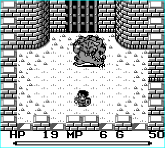
The Gameboy. Allowing a possible 4 different shades of grey. Now THAT is restriction at it's finest, heh. You don't get much worse off than that unless you're trying to use CGA or something. I have the utmost respect for the artists of old...I mean, look at this shot from Final Fantasy Adventure. You know it's a castle, you know there's grass in the middle, rocks on the outer edges...You can tell that's a large tiger creature thing. You can see your character and tell he's dressed in armor. And this is all done with 4 measly shades of grey (technically white, black, and 2 shades of grey). THAT, my friends, takes skill to do. Problem-wise, they've go the generically ugly "plastic" bricks (and if you've been reading this entire tutorial, you should know by now much wrong that is, heh). Of course, it could just be a new castle...heh...Like they just spring up in a day. Anyway, the grass is a slight variation on grass...it's still a bit cheesy like the "few light dots on a darker shade" style...but this has a little more strategy in it because of that one line that's two pixels high in each "patch". It makes your brain think "This isn't freshly mowed flat grass...This is long stringy stuff". All from the one pixel. In the old days of Gameboy, you'll notice a lot of the sprites look like the tiger and character in here, shade wise. The backgrounds tend to be very contrasting. If the backgrounds are all mostly white, like this one, the sprites are usually colored with dark colors like this. Parts of the background are done using light colors, like the rocks/grass patches on the ground...They don't use black, just light shades of grey, to make them less contrasting (as you learned up above with the cave floor, that's what you want to do...keep the player and other sprites obvious).

Another incredible scene, especially when you consider that again, this is done with 4 shades of grey. The waterfall bottom is a bit cheap...An animation of "foaming" where the water was falling and hitting the other water, splashing and such, would have been nicer, but the effect is made. Check out things like the rocks in the background, some light and some dark...This is like the cave floor from above, the light rocks have grey as a background, and the dark rocks have black. The light rocks COULD have still had black as a background, but they don't, and that's the point. The waterfall also demonstrates dithering...There's no black in there, and there's only 3 colors, but it feels like a gradient because of how the colors are placed. The trees don't have a gradient fill on them, they're built up from the pixels, and use black only for certain extremely dark parts in the bush. If they were outlined in black, they'd clash with the sprites in the game...In fact, almost nothing in the game is completely outlined in black except the sprites. This is another technique used to separate sprites from background.
(I will continue this section later, there's still a lot to cover...But I feel like writing about sprites now, so here goes...)
Back to main...